Graphs and Statistics
There are three kinds of lies:
Mark Twain or Benjamin Disraeli, based on
https://www.tap-illinois.org/there-are-three-types-of-lies/
and https://en.wikipedia.org/wiki/Lies,_damned_lies,_and_statistics
Statistics can be used as an easy way to present lots of data in an informative way. Simple figures like average, minimum and maximum of certain numeric data allow people to grasp the significance at once.
Formats to present statistical information are tables or graphs. Graphical data is far more attractive to look at and conveys a certain message more efficiently. “A picture says more than a thousand words” is a well-known saying many people will agree with.
However, as the quote suggests, statistics and particularly graphs can be very deceiving or be used to deceive easily. People in general are very bad at statistics and estimating chances of failure or success. Commercials for big lotteries abuse this all the time when they ask people to participate and show big prize winners being very happy. The many, sad losers are, for obvious reasons, not brought into the spotlight.
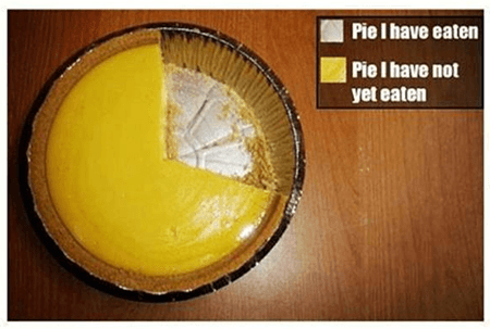
In the picture, the only accurate pie chart is shown. The legend is hilarious. Interesting to note is that legends are scarce or incomplete nowadays in popular writings. When I was still at university, I learned that a diagram needed to be self-explanatory and could be taken out of context and still be understood.
Tagged pages
| Page | Date | Tags |
|---|---|---|
| 2021/01/06 10:48 | Graphs and Statistics Humor |